Redesign
UI & UX
Oct, 2017
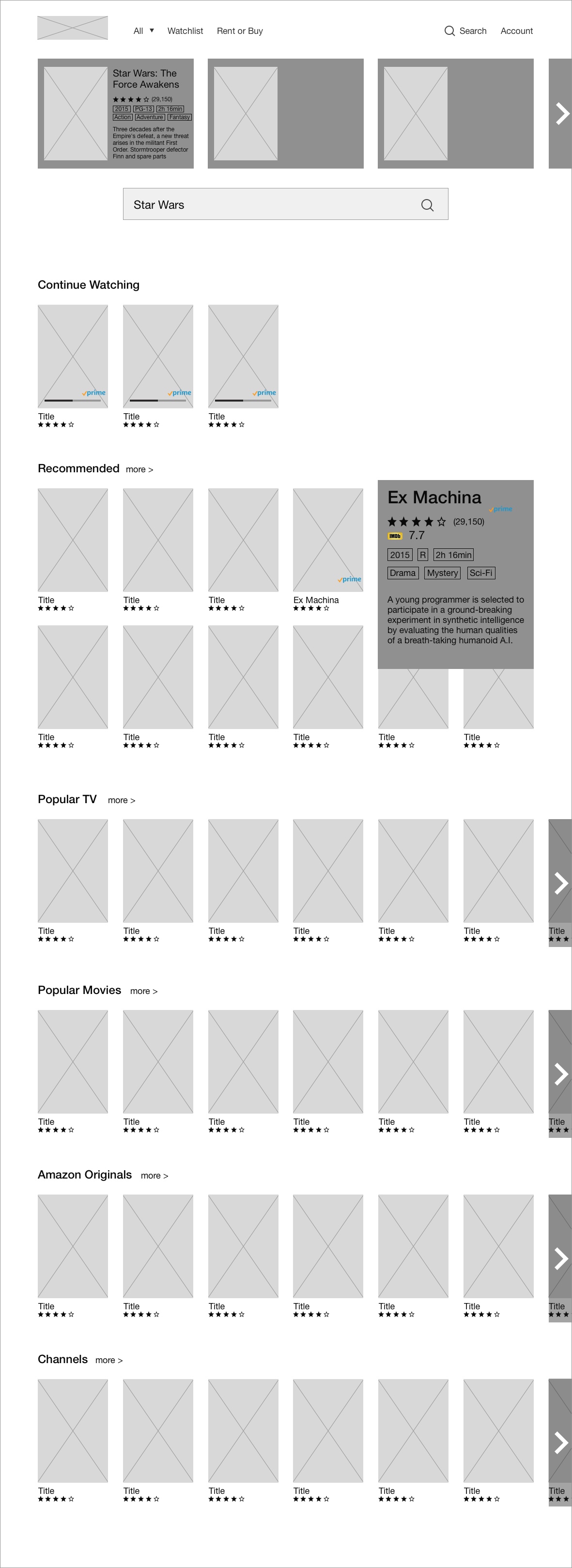
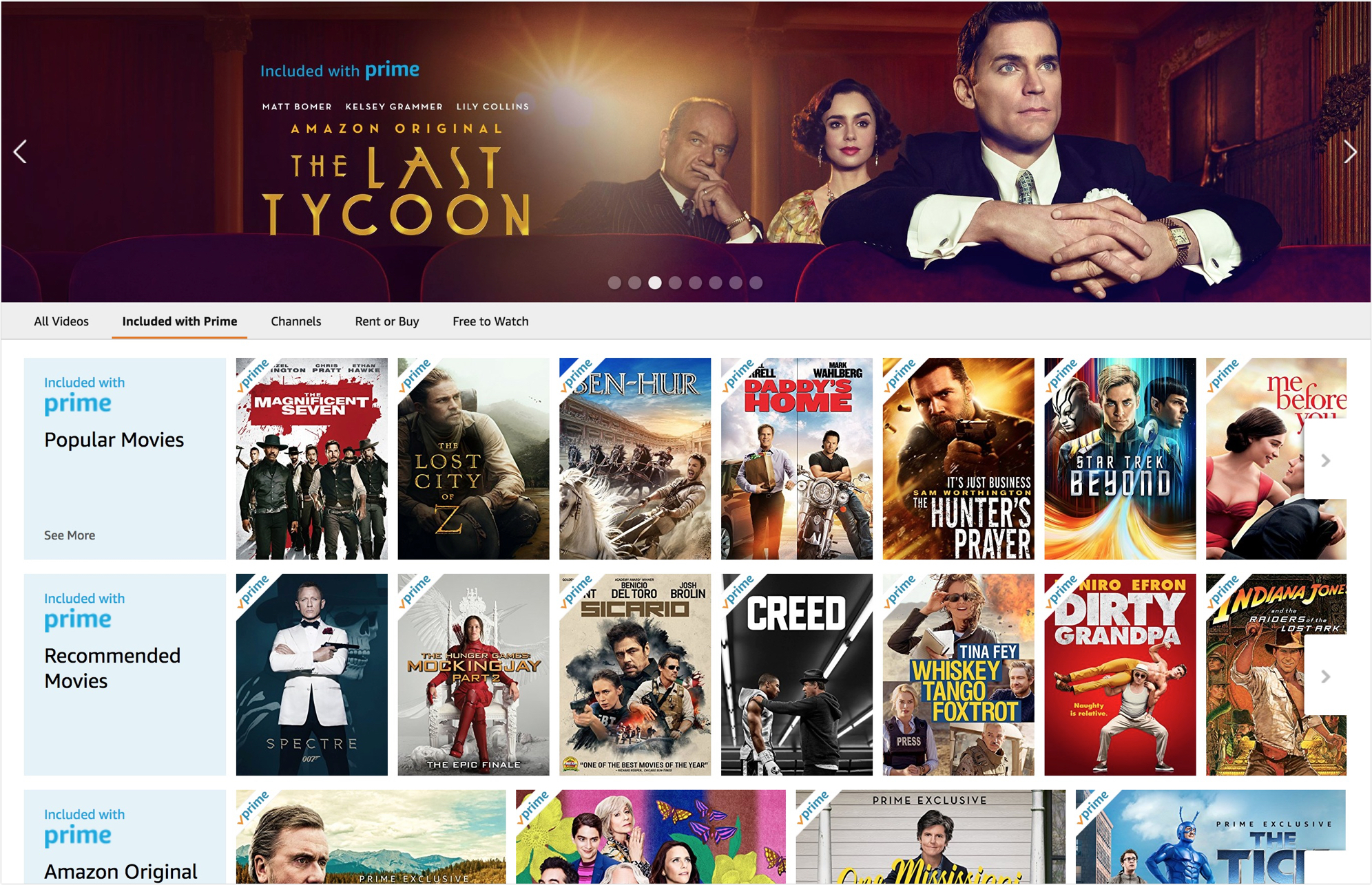
Research by Erik Runyon showed that only 1% of site visitors clicked on the carousel feature — and 84% of those only clicked on the first slide.
Carousel: It was designed to contain more information near the top of the page where may have greater opportunity for people to see it. However, it has been proved less than 1% of the users click and see the extra information. In fact, a simple, attractive movie/TV banner has a higher conversion rate comparing to the carousel.
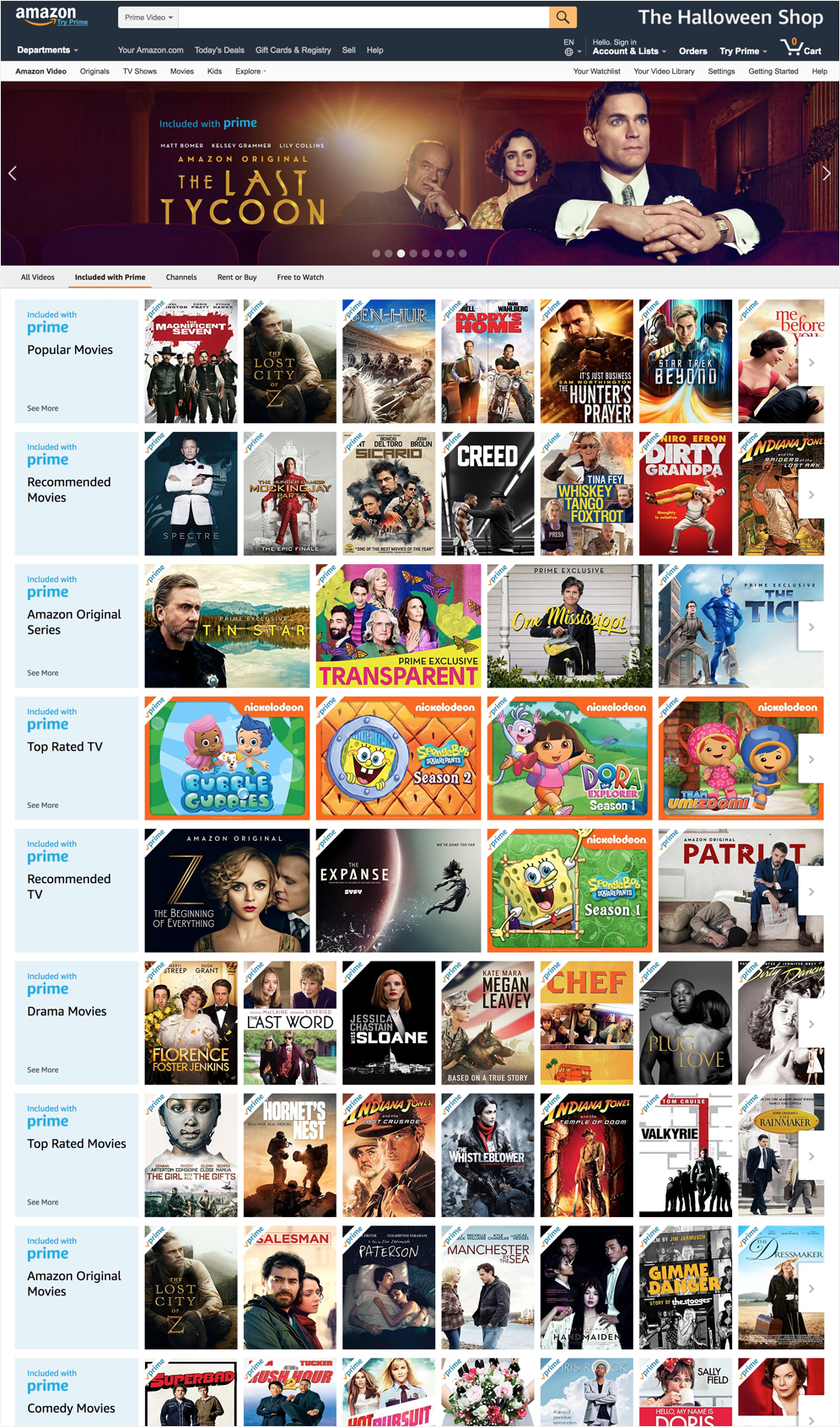
Negative Space: It helps people separate and recognize different groups of items. For example, different categories of movies. Embracing grid system and letting negative space does its job.
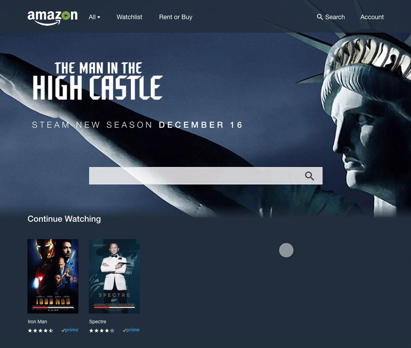
Besides prime videos, Amazon Video connects a number of video streaming services, including HBO, Showtime, PBS, etc. Also, Amazon Video provides Rent or Buy videos services. With a large number of movies and TV shows, search becomes a fundamental method for users to access the video they want.
Instant search enhances the search experience to a new level.
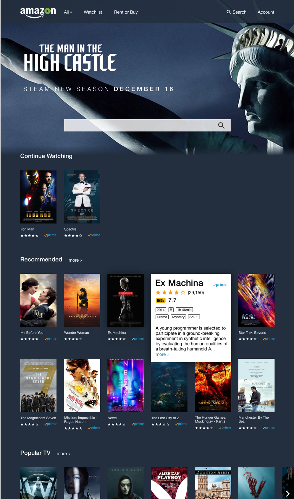
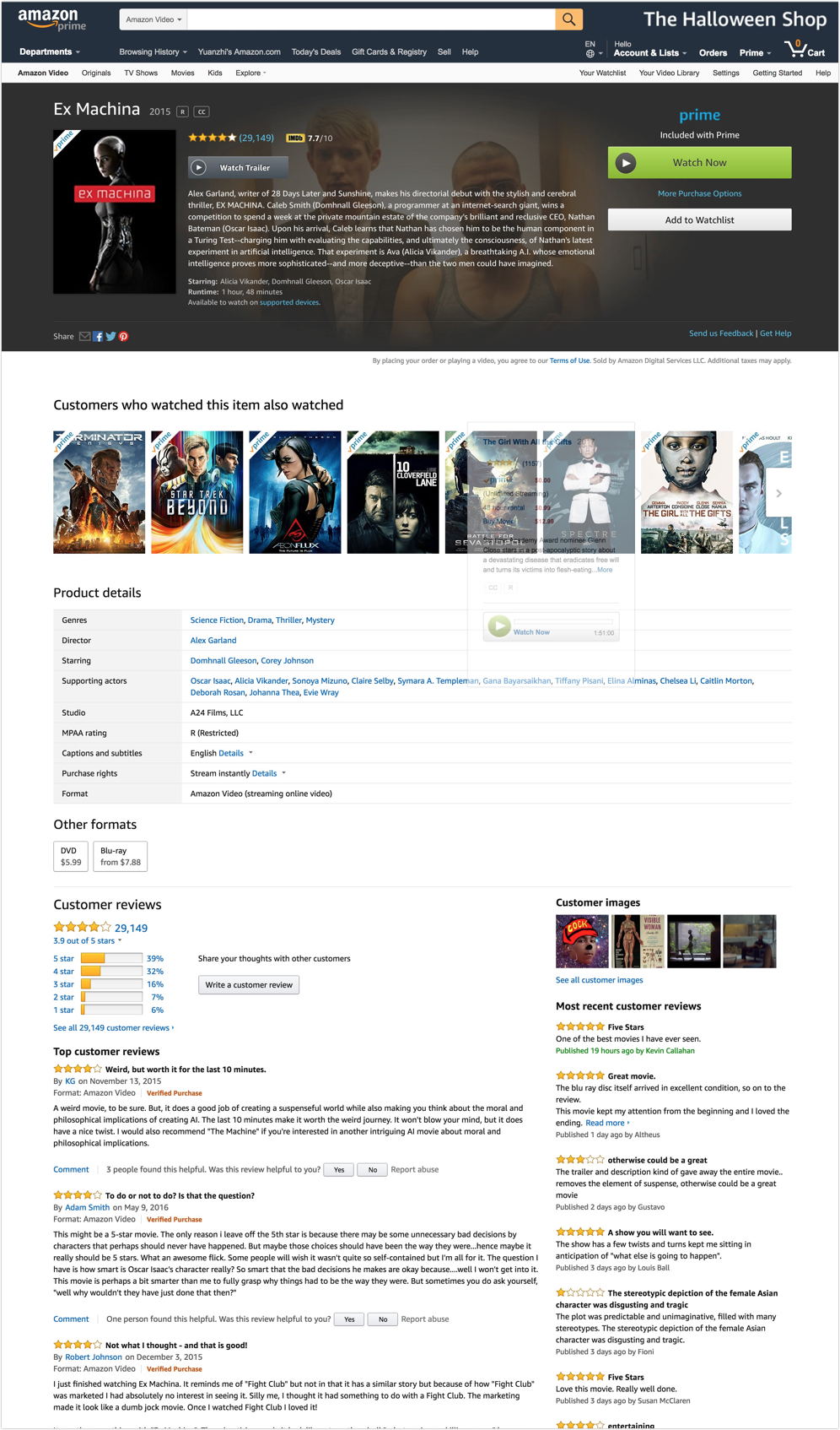
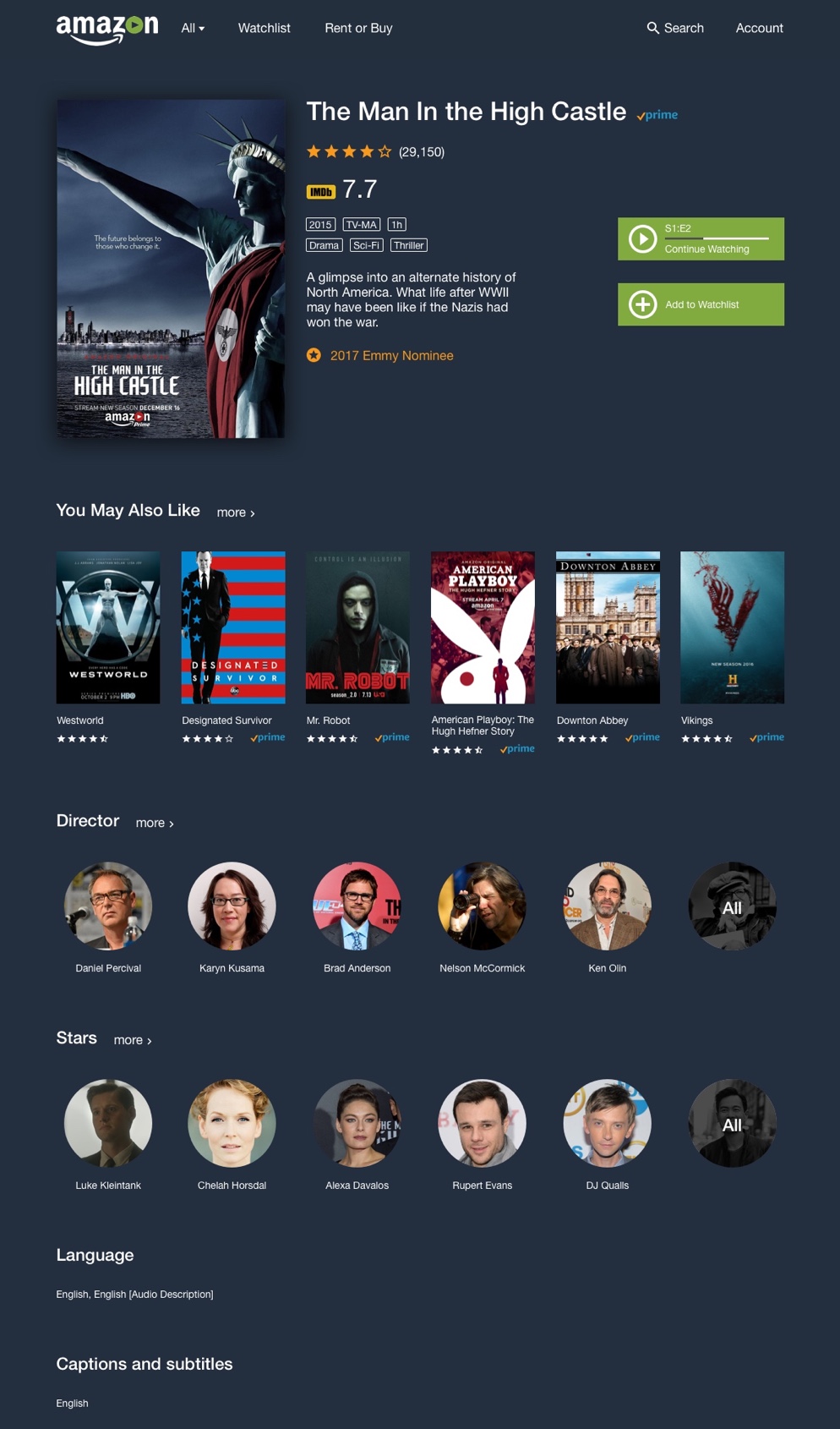
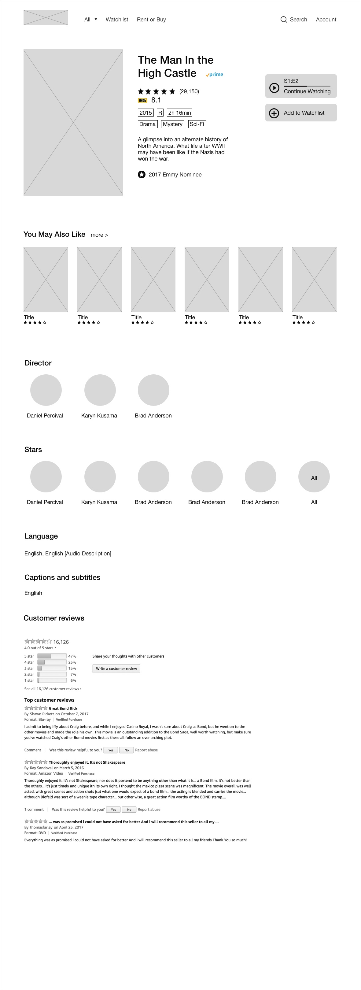
Video information should help the users easily decide whether they like the video or not. Apparently, all mass data won't help. After several rounds of user interviews, I redesign the layout of the video detail page. Rating, short intro, rewards, included with prime, all the selected contents are placed in the right spot for easy glancing.